

Since rejoining the fold, the Winnipeg Jets have been one of the NHL’s premier franchises in terms of success with a 519-381-95 record since the start of the 2011-12 season. They’ve found ways to win more games than other Stanley Cup Champions during this span like the Los Angeles Kings and the Chicago Blackhawks.
The Jets’ run of success has made them a repeat contender for Lord Stanley and they’ve continued to do it while looking fashionable in stellar-looking sweaters. The classic Jets home and away jerseys have become a staple in the hockey world with new alternate jerseys cycling through to keep things fresh. Today, we look to rank alternate jerseys in recent memory and show love to ones that deserved more attention.
View the original article to see embedded media.
1. 2016 Heritage Classic White
View the 8 images of this gallery on the original article
The Jets didn’t come home with the win unfortunately but did outclass the Oilers when it came to the sweater game. Edmonton’s popping orange worked in a stadium setting but when it came to the rest of the regular season, the Jets jerseys couldn’t have been better. The new rendition of the classic 90’s Jets uniforms from the Keith Tkachuk days with the new team colors made this sweater pop more than people expected and became the template for what Jets alternate jerseys would look like in following years.
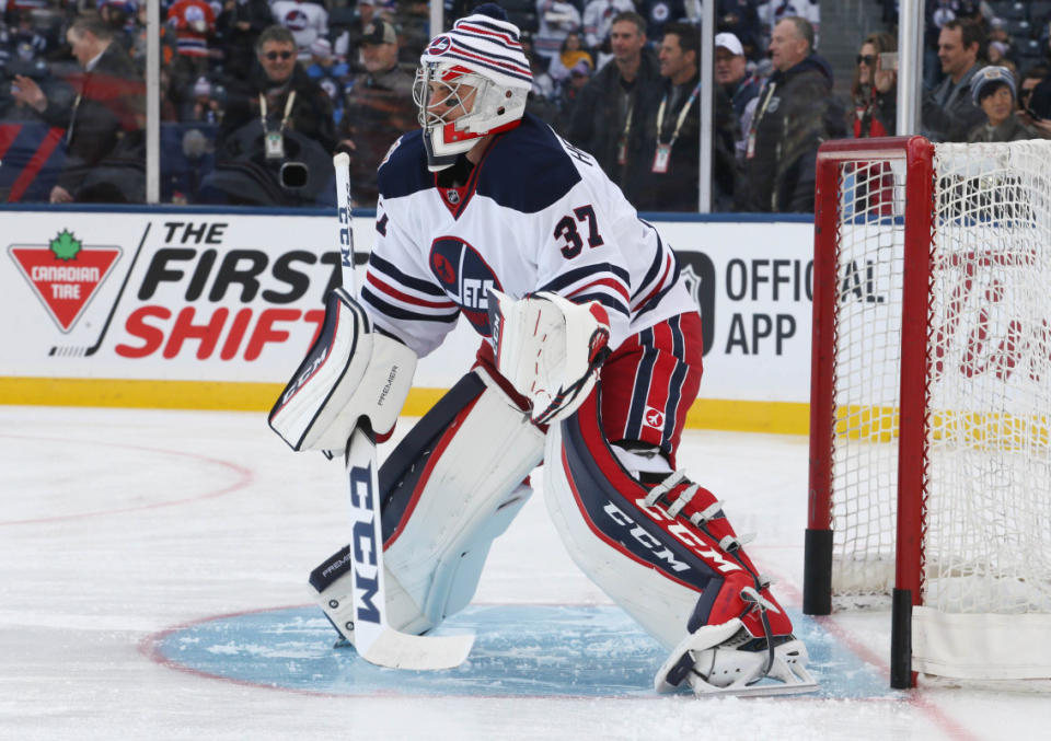
2. 2019 Heritage Classic Blue

View the 4 images of this gallery on the original article
The Jets were successful in their second Heritage Classic with 2-1 win over the Calgary Flames. The win was a special one for the team and they have since kept this jersey in their current rotation of uniforms as an alternate today. This home style version of the 2016 Heritage Classic uniform was a surprise hit for the team and has remained one of its go-to sweaters when the team wants a change from the standard home option.
The sweater was worn in big-time moments this past season like Connor Hellebuyck making a sensational pad saves against the Blues and Oilers or Axel Jonsson-Fjallby scoring on a breakaway off a sweet bank pass from Dylan Samberg versus Detroit. We hope this one continues to stay, as it continues to remind fans of the team’s rich history.
3. 2022-23 Reverse Retro White
A true modern day approach to the Jets classic 90’s jersey that has the coloring in the shoulders removed and gives us the vintage sweater feel. The heightened blue tones also help make this jersey pop and gives it an ice cold tone that suits the city of Winnipeg for its classic whiteouts in the playoffs.
As most know, alternate governor and team president Mark Chipman is not a fan of red, or red colour schemes on jerseys. So, this setup would certainly be one of Mr. Chipman’s stop choices.
4. 2023-24 RCAF Centennial Blue

View the 4 images of this gallery on the original article
The Jets celebrated the Royal Canadian Air Force’s Centennial 100th anniversary with sweaters paying homage to 1948 RCAF Flyers. The “Forty-Eight” jerseys were worn this past season and quickly became a fan favourite and a solid option to their growing jersey rotation that had now reached four jerseys at once. The lines through the middle make this jersey feel not as clean as our prior picks but still a very good option.
5. 2021 Reverse Retro Grey
These were met with not the most enthusiasm as our other picks. Grey is never the greatest color for a hockey sweater but these are probably the best they could’ve done. The logo and color scheme for the jersey work and could’ve looked better in white, which the team recongized and changed for its 2022 Reverse Retro design.
6. 2018-21 Alternate Blue
View the 4 images of this gallery on the original article
The effort was there to do something very different for a third jersey and for some fans these sweaters are their favourite, but most others really didn’t appreciate the stylized wording they used on the front. It is a bit off looking and the rest of the sweater is quite plain with the lines on the botttom of the jersey being the only other touch to the design.